
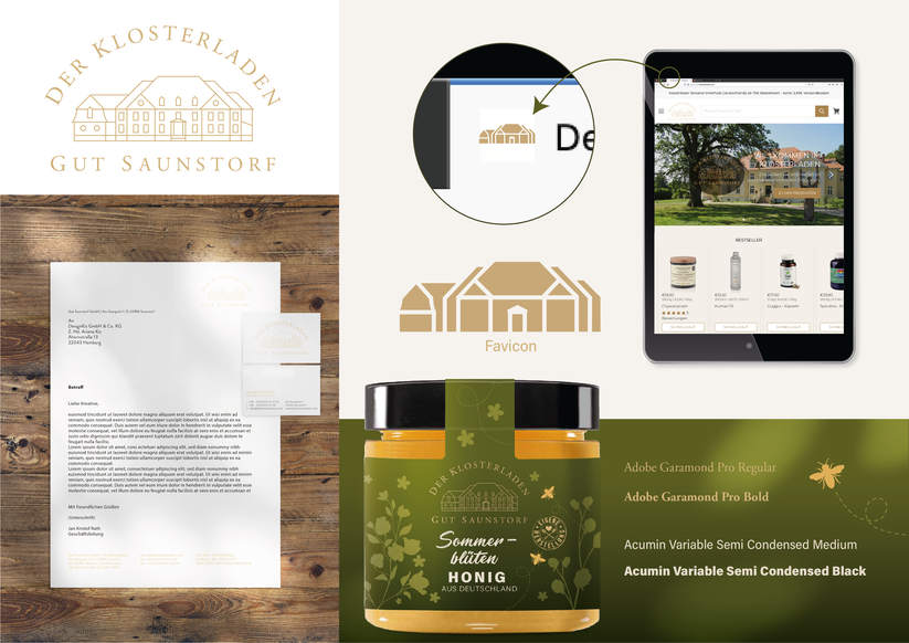
GUT SAUNSTORF | Corporate Design
In addition to the changes in the packaging, it was of course a special honour for us to be allowed to revise the corporate design for the Klosterladen. It was important for us to create a more
direct connection to the monastery in the logo, so that a visual unity is created and the desired togetherness becomes clear to the customer.
Accordingly, it was obvious to use the logo of the estate as a starting point and then adapt it accordingly for the Klosterladen. Lines were reduced to create more clarity and make the logo
appear younger and clearer overall - resulting in a symbiosis of tradition and modernity. The warm gold-beige stands for closeness to nature, warmth and proximity paired with high value and
quality. The new business equipment was created on this basis.
While the stationery was a logical continuation of the newly developed logo, the favicon required a different, particularly reduced approach for an adequate miniature display in the tab of the
browser window: the fine lines of the logo for the very small format had to be greatly simplified and converted into areas to give online shoppers a better feel to be able to guarantee a
representative reference to the brand in the reduction. Why don’t you just click in yourself?