
CORPORATE DESIGN
Together in favour of the environment
„Loveco“ could be developed, because all cooperation partners shared a common
demand on ecological sustainablity. All partners participated in this project, actually without payment in order to prove that highest quality, modern design and environment protection conjunctly is representing the vision of sustainable luxury products.
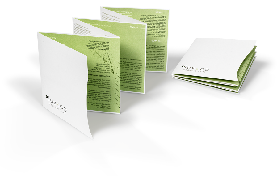
The twelve sided folder in Z-fold intr duces the product and all cooperation
partners. It is bilingual (German and English) and attached to the present box .
DAS LOGO
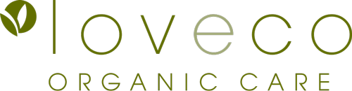
Every beginning is the logo
Already in finding the name and in developing the logo, we wanted to focus on our
„love of nature“ which we share with the product. So we did exactly that – combining the attributes „love“ and „ecology“ to a word-image brand: „Loveco“ was born.
A clear typography in covered green with an additional icon, which quickly and simply communicates „nature“ by two snuggling leaves, were the answer to these design suggestions.

DAS LAYOUT
The first impression counts!
Aesthetic purism meets heart for ecological sustainability – this is, what we wanted
to communicate immediately with the first impression of „Loveco“.
Designing „Loveco“ we followed the credo:„less is more“.
The result: Only two green colour accents, in harmonic unison with the unpretentious white of the packaging material, give a clear and natural appearance.The reduction of the number of colours and the application of mineraloil-free and low migration colours emphasize the ecological character of this project. For packaging we used as little material as possible and just as much as necessar