
CHOCOLATE
Task
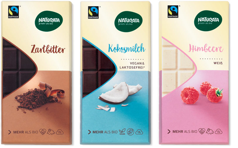
Design relaunch from the produce category “Chocolate”.
Background
The design concept follows the “best-food range” guidelines systematically. The logo caries the brand with its unique form and strong contrasting colors.
The “>” symbol is portrayed in the style of a window, letting the customer see what they are buying. The “reasons to believe” are depicted
with a minimalized iconology on the front as well the minimized information boxes on the back of the packaging. The brand recognition is thanks
to the lightly optimized typography and the never changing Naturata cream color. In the process of our organic packaging strategy
we ended up changing the packaging for the better of our environment
(changing the aluminum foil wrapper with a mono material OPP foil and the outer cardboard box with one that’s recyclable).
Implementation
Launch: Summer 2017 | 17 Products