
PASTA
Task
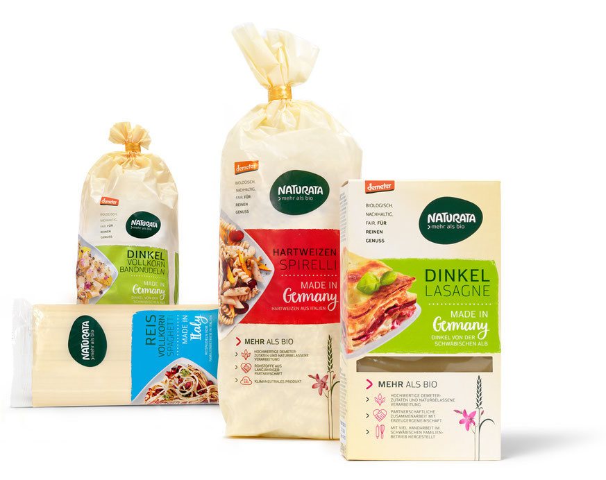
Relaunch of the entire product line of “Pasta” following the new corporate design of the Naturata brand.
The “Pasta” falls under the design concept of the “core range” products.
Background
The logo that is implemented stands out due to its contrasting colors and form. The “>” symbol is positioned at the middle of the packaging,
lightly overlapping a colored banderole with a plate full of the correlating pasta, or a window cut out of said pasta, which in turn the “reasons to believe”
are validated through the iconology on the front as well as the information boxes on the backside of the packaging.
The brand recognition is reinforced through their never changing typography and cream coloration.
Implementation
Launch: Spring 2018
Roll-Out: Spring 2018 | 26 Products