


FÜR Juices
Task – A demonstration for more sustainability.
FÜR juices stand for health and a sustainable, fair agriculture. An innovative, eye-catching and emotional design was developed, entering into a direct dialogue with the customer. It is the line of juices coming in cheerfully in language and tonality and at the same time working actively for the topic good and sustainable agriculture.
Background – FÜR more stories around sustainable agriculture.
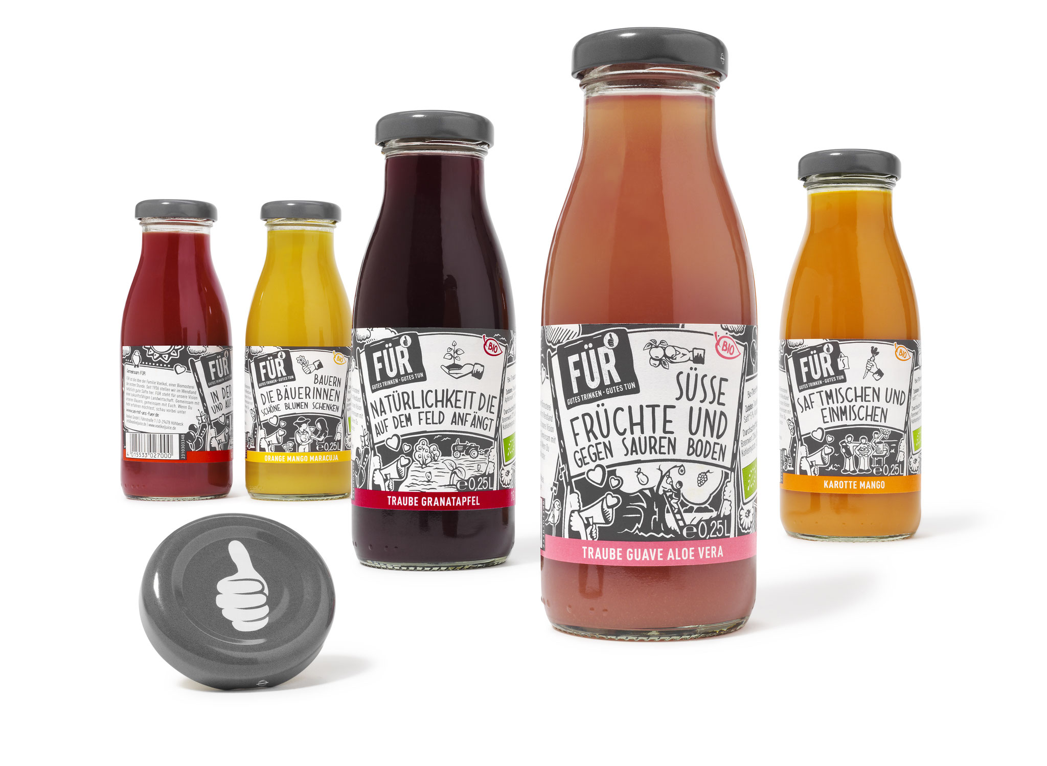
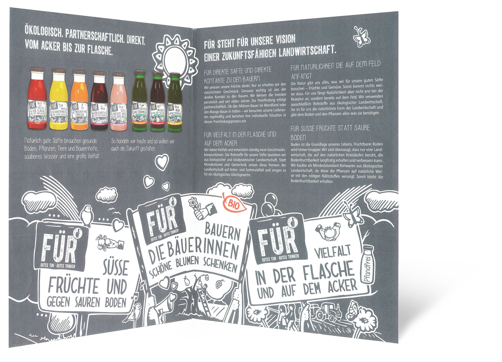
With this beverage innovation the name was program from the start: FÜR is made for people enjoying good drinks and the idea to make the world a bit better every day. To be for something means to be active, to intervene. From this we have developed different consumer statements you can find on the label designs of the bottles and who invite the consumer to a stronger identification with the product. And who places all six varieties next to each other will happily note that the small bottles with sustainable messages demonstrate true greatness.
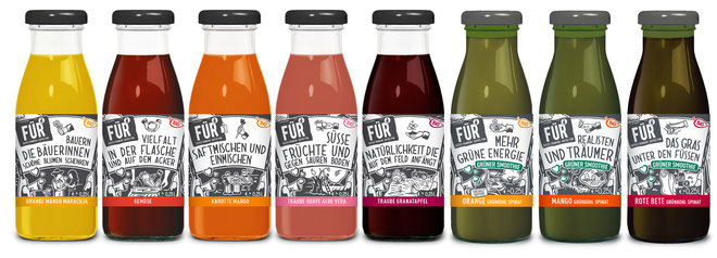
„FÜR for direct juices und direct contact to the farmers”.
„FÜR for a sustainable future“.
„FÜR for farmers, who give flowers to a woman“.
„FÜR for lemonade tasting less sweet“.
„FÜR for living in the country and celebrating in town“.
„FÜR for drinking good and doing good“.
"We have chosen this particular style of illustration in order to give a positive visualisation of the brand FÜR, which means to be in favour for something and via product design by itself to initiate a direct dialogue with the consumers. The challenge during this project was to generate a design with high impact on the shelf and at the same time to communicate the story behind the product"
says Ariane Kis, chief executive of DesignKis.
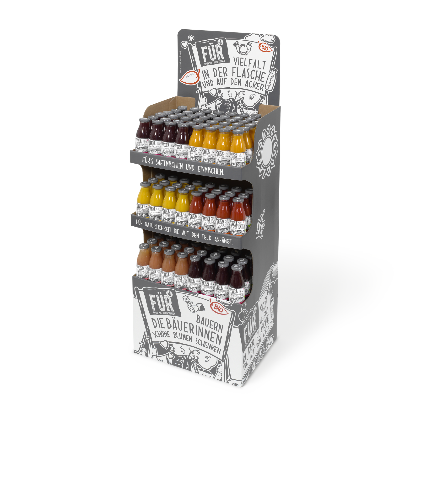
The brand stands for the topic active and sustainable agriculture. An innovative product with an exciting story that of course had to be staged accordingly in order to sell without big money for listing into the shelfs of specialist shops and the LEH.
Moreover the design was to score with the consumer by claiming attention, giving an impression of strong character and to catch the eye. DesignKis and Voelkel with a prime example how brand, agency and consumer walk hand in hand.
Sustainability and environment compatibility are reflected also in the bottle resp. in the packaging materials used: The label paper carries the environment PEFC logo that guarantees the safeguarding of sustainable forest management. The glue used is vegan and the 0,25l glass bottle can be recycled environmentally friendly.
The launch of the juices made of 100% Bio raw material is running since May 2015. And should you come across a demo on the cooling shelf of your favourite LEH, then join in and set a sign for sustainable agriculture – try it yourselve!
Implementation
Launch: May 2015
Roll-Out: 2015 | 5 products