
CORPORATE DESIGN
Task
The standard as well as the organic meat produce are known for their red WASGAU logo. The packaging from the organic products keeps its green packaging and the standard products keeps its red sticker, however a newly designed light woodgrain background. Follow the constomer request is most of the celegory specitic textures visualized with the colored (especially by the stanard products).
Background
Alongside Naturata, WASGAU has become our second successful pilot project in the area of Organic strategy optimization. Through the reassessment of their packaging materials, printer specifications, as well as finding a new delivery service they were able to save upwards of six figures. Through the optimization of their autoclave they could even achieve a better tasting product. All of the measures above can now be used in other organic packaging strategies. A central point of discussion is changing the packaging materials that are being used. For example, making the foil wrapper out of a better recyclable material. Thanks to optimization of the packaging we are able to fulfill the new EU Law whilst saving money doing it.
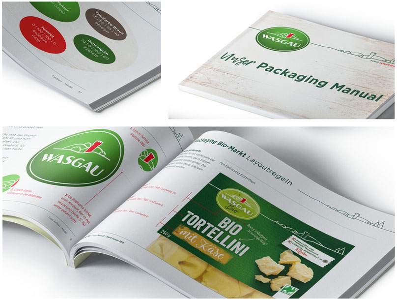
The WASGAU Brand carries various types of produce goods, being fresh produce, meat produce, and baked goods. These product ranges are labeled with their respective colors: green, red, and yellow. The organic logos are set apart by their design, which is illustrated by a watercolor like background. In order to portray the natural, traditional, and regional type feeling of the product, the WASGAU design was transformed into a stamp like typography. This typography illustrates a handmade type feeling for the product. The varying products are told apart from their typographic nature only.
The design from the packaging of the organic produce is denoted by its green packaging, whilst the standard produce that of light woodgrain optic. This color correlating packaging, logos, typography, and illustrations allows the customer to be able to distinguish the WASGAU Brand from others with ease.
On top of any WASGAU product you’ll see the hilly landscape that’s always at the top of the packaging, which merges with a line from the landscape that ends in the logo.
The design changes of the organic pasta alone was enough for a sales increase of 40%.
WASGAU was our second successful pilot project in accordance with the DesignKis packaging strategy after Naturata. In step one we reviewed the classic design and strategy development, whilst Tilisco surveyed the print specifications with regards to the environment.
The final production costs were able to be lowered and the saved monetary assets could now be invested into the DesignKis packaging strategy in step 2. A central point of discussion is changing the packaging materials and specifications that are being used. For example, making the foil wrapper out of a better recyclable material. Thanks to the high recycling rate we are able to fulfill the new EU Law whilst saving money doing it.
